*The above mapping project was created using the slave narratives from the Federal Writers Project (FWP) under the New Deal reform. The complete set of data and information can be found here on the Library of Congress website.
Overview:
This posting has two main parts; the first is a brief reflection on Kepler as a mapping tool (how the tool is used as an instrument of research and within the digital humanity field), the second section is a new user guide, offering general, introductory sets in setting up and displaying a mapping project.
Part I: Reflection:

The theme for the past few weeks has been data visualization. This week’s discussion was over mapping data to produce location visualization on a map. The primary of purpose of many digital humanities projects is to present the data, not necessarily have the visualized or digitized date make or allure to an thesis or argument. Mapping is one such digital tool that allows researchers to visually see location metadata.
Firstly, one starts with geospatial metadata or data that had geo-locational data. Metadata, being data of the data, often contains location. Specifically, using the slave narratives from the FWP one is given two sets locational data: the first is where the interview was conducted – a vast majority of these interviews were recorded and conducted in southern states such as Alabama or Georgia. The second set of location metadata is where the former slaved worked or was enslaved. Both of these are locational metadata. In other words, for this mapping projects, researchers are not fully invested in what was contained in the interview, but more interested in the metadata of each interview. After one has narrowed in on the geospatial data, one is then able to add those locaitonal data points to a mapping program like Kepler.gl. This particular software allows for the creation of both 2D and 3D interactive maps. The key word being interactive. A researcher or common visitor to the map and scale and move the map to focus on specific data points.
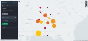
This is all well and done; however, why does this matter? The answer: because mapping projects allow for analytical connections to be made that would otherwise be hard to depict. For example, one could very easily over look the fact that the interview location of the subject could be different than the subject’s enslavement location. In other words, referring to the interactive map above, one can see that a large amount of interviews were taken in Mobile, AL; however, the data lines emanating out indicated that the enslavement location was not Mobile, AL (note bene: each data line and data point is one interview, and the red part of the data line shows interview location, while the blue indicates subject’s enslavement location). Plotting these data points allow for a new level of interactivity that hard-copy sources does not allow or even data spreadsheets.
Another major advantage of using mapping tools is the ability to add layers and multiple sets of data. In many ways, one is able to compare different sets of metadata from the same data corpus. Although we are examining slave narratives from the FWP digital archive, there are two sets of metadata being compared to each other. The first is the location of interview, and the second location of enslavement. However, this digital archive is vast and we could calculate enslavement location versus birth origin. In any case, this tool allows for data comparison in real-time, something that would be very difficult in the hard-copy archives.
On the topic of data manipulation and interactivity, mapping software like Kepler allows a user to display the data differently for ease of viewership. Say the data lines are too messy and hard to read, one is able bring up a heatmap. This is a map that shows location of interview density – gives a more specific location and density reading of Alabama. Using the map below, one is able to use the heat map to show density of interviews revolving around urban cities as the primary interview locations.
Part II: New User Guide

This section contains a brief overview for new users, showcasing the important features of data usage and data visualization within the Kepler.gl software.
Firstly, one must upload the data to Kepler: a CSV or add kepler.gl downloaded data set that has already been added to your device. Kelper has provided a more in-depth discussion of the document types usable for upload here.
After upload, Kepler will create this as your first layer; therefore, rename the layer to best describe what you want to use the data for (are they interviews or something else?). Simply, think of layers like stain glass from a church. The sun shinning through is the complete dataset (in many cases, the large amount of data is overwhelming), but the layers (each individual plate of glass with its own color) is how we choose to visualize and narrow down the data into bit-sized chunks. The more layers of glass you add, the more the color changes – meaning, the more layers on the map you add the more data points will be displayed.
However, after you have added all of the layers you want (meaning, all of the data points you want to visualize. Be it time, location, or some other data subset), you can limit the data even more via filters within each layer. One of the most common filters is time. One can limit display of specific interviews to a specific month or year period. This is done by clicking “Add Filter” in the top-middle. Keep in mind that filters apply to all data layers of the same data corpus; therefore, if you are using multiple layers for the FWP interview project, the month or year time filter will be applied to all layers.
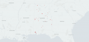
There are also many options to choose from when displaying your map. Under the layers tab, select which layer you want to manipulate. One of the most common display choices is “point”. As seen below, this is a simple data point map showing interview location.
Another common display of for the layer is line. As seen in the very first map that beginning of this point, line data visualizations allows one to visually see connections and the usage of layers. In that example, the data lines shows the connections between interview location and location of subject’s enslavement. The red indicates location of interview and the blue indicates enslavement location.
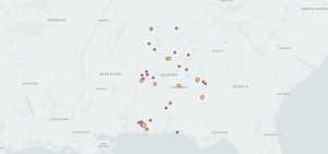
Heatmap and cluster maps are two more common maps. Heatmaps show the density of data points. In this example, the larger and darker the color, the more interviews occurred in that location. Cluster maps show locational metadata can be jointed together. Simply, cluster maps bridge the geographical distance between data points to give the viewer a more general understanding of interview location. Below, I have attached a dual map – both cluster and heatmap.
In the end, this is merely one of many tools for data visualization. Text analysis, mapping, and networking programs are all within the domain of digital humanities. Next, we will dive into the world of network mapping. Slightly different than that of Kepler, yet networks present a whole different story.