
Overview:
This post will continue our discussion of data visualization, moving us on to network analysis and the networking tool Palladio. Like previous postings, this entry contains two sections: the first is a general overview of the network mapping tool Palladio – what the tool allows one to do and any special visualizations tools it contains – the second section is a “how to” or new user guide – this section gives a brief overview to new users, offering introductory instruction in data visualization in Palladio.
Moreover, like previous postings, we will be using the slave narrative data corpus compiled by the agency Works Progress Administration (WPA) under the Federal Writers Project (FWP), 1936-1938. The entire digital collection can be found on the Library of Congress website here.
Part I: Palladio as a Tool
Firstly, Palladio is a networking tool. Networking tools, therefore, present connections between discrete sets of data points for nodes. In other words, programs like Palladio attempt to use mathematical algorithams to connect and display that connection between data points. Yes, this may sound very similar to our previous mapping project with Kepler; however, Palladio not only does data mapping but also graphing. It is in this graphing that networks are created and displayed to be interactive.
Again, using the data from the FWP slave narrative collection, I have complied a network graph. In this graph, of primarily Alabama interviewees, one can see two distinct data sets. The larger, darker colored circles are showing interview location, while the smaller, lighter colored circles are showing enslavement location of interviewee. Because this is only a screenshot it is not interactive, but under normal circumstances, one is able move and zoom in on the map. One is also able to select a data point and pull it out away from the center, making it easier to read and follow the data line.
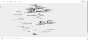
As one can see, this, like the other programs, is a data visualization tool. Yet, this network graph is showing connections between the two discrete data sets. This map, perhaps, is the best visualization tool to show location of interview. This graph is clear that there are about five to six main cities within Alabama that held the vast majority of interviews, although the former slave originated from outside of the cities.
Moreover, networking tools like Palladio offer the user the ability to place this data on a map, slightly similar to a mapping project. However, the main difference is that network projects focus primarily on larger, overarching data points such as city or town location, while mapping projects can be very, very detailed. What I mean by detail is that mapping projects can create detail down to specific blocks or streets within cities. In many cases, mapping projects try to tell the researcher what the daily life was like for someone living in city “x” or city “y”, while a networking project simply tries to connect larger pieces of data together such as location of travel or people meeting each other. For an example of a highly detailed mapping project, I would advise to visit digitalharlem. This is a mapping project that recreates the place and site that was Harlem, New York during the 1920s and 1930s. However, a networking project that displays connections, networks, and linkages would be Linked Jazz. This shows how networking projects do not have to rely on a map (either modern or an overlayed historical map) in order to show connections. In many ways, networking projects like Linked Jazz show these larger connections – connections of people or of places.
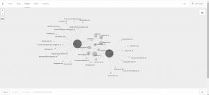
In the end, networking projects allow researchers to create and display connects that are more than just geographical. Palladio specifically allows users to choose data connections points or nodes. One can choose the which data sets to compare. Simply, the above graphs show a comparison between interview location and enslavement location. However, as long as the data corpus has the subset of metadata in place, one can choose, in this case, any type of comparative combination such as interview locations and interviews broken down according to gender of interviewee. (An example of that graph can be seen below.)
Part II: New User Guide
This next section contains a brief overview of Palladio for new users.
Firstly, one can find the Palladio website here. One can upload or copy and past .csv or spreadsheet documents of the data. If one is using a spreadsheet, then place all the data points in discrete columns (data such as location of interview, gender of interviewee, or enslavement location).
Secondly, the “map” view places your data points on a map. In the upper right hand corner, there is a map layers tab. This tap shows you all the comparisons occurring on the map. The first layer is the first data comparison – the “source” category is where the data points will start, and the “target” is where the “source” data points will be compared. A data line is then made between the two points. One is able to manipulate the data point size and highlighting.
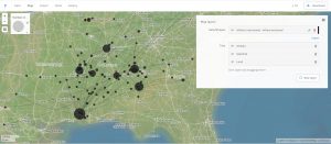
Then, one is able to add layers to the map. One can add more data points, or, by clicking on the “new layers” then “tiles” tab one can change the visualization of the map. Below, I have attached a network map with added layers of tiles to show states and cities. See the right hand corner for the map tab, notice how under “tiles” I have added new layers to the map.
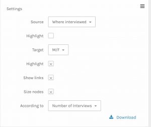
The next important feature in Palladio is graphing – to select graph go to the upper left hand of the site and select “Graph” and the data will transfer over. A graph is just a blank canvas that displays the networks between data points. Going back to the network graph of gender of interviewee and the interview location (see two screen captures ago), one is able to manipulate the graph by selecting a new source and a new target – the same principle from the map still applies – the source is the starting point of the data and the target is the comparison point. I have attached a picture of the settings tab for the graph below.
For those interested, one is able to save their project as a .json file. This is a compacted filed that contains some of the slave narratives (mostly from Alabama). One can easily upload this file into Palladio to jump straight into playing with the data. However, note bene: if you added filters or data limiters before you downloaded the .json file, then those filters will still be intact. To save a .json file, select download in the upper most right hand corner. The download button on the “settings” tab will download the map or graph being used as an HTML/svg (scalable vector graphs).